Brands We Love: Pantone’s 2024 Color of the Year
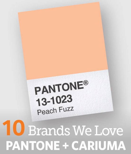
“May you live in interesting times” can be seen as a blessing or a curse. The “highly unusual times we continue to find ourselves in,” according to Vice President Laurie Pressman, shaped the Pantone Color Institute’s selection of its 2024 Color of the Year, Peach Fuzz.
Pressman describes Peach Fuzz as “nestled between pink and orange.” “Heartfelt,” “nurturing,” “comforting,” “compassionate,” and “welcoming” are other words she uses in discussing the soft, warm shade. It won’t jump out at you from a store shelf or a newsstand the way the previous two Colors of the Year, 2023’s Viva Magenta and 2022’s Very Peri, might. Instead, it quietly invites you to come closer and get to know it better.
Warm and Fuzzy
Viva Magenta was described as “expressive of a new signal of strength.” Very Peri, the first-ever hue Pantone created specifically for its Color of the Year, was deemed as having a “spritely, joyous attitude and dynamic presence.” While those colors were vivacious and bold, Peach Fuzz taps into what Pressman says is “an increased focus on community and people across the world reframing how they want to live and evaluating what is important: that being the comfort of being close to those we love.” You’d have to go back to the 2016 Color of the Year—which was actually two colors, Rose Quartz and the dreamy blue Serenity—to find a selection that emphasized tranquility and comfort to a similar degree. Pantone Color Institute’s executive director at the time, Leatrice Eiseman, said that the two colors reflected “connection and wellness as well as a soothing sense of order and peace.”
That description could apply to Peach Fuzz as well. More than the cooler-in-tone Rose Quartz and Serenity, though, this year’s color is warm and intimate, ideal for brands that want to communicate a sense of closeness and caring. Motorola, an official partner of the Pantone Color of the Year, plays this up with the Peach Fuzz edition of its Razr phone, which it says highlights “the importance of shared moments to build connections.” Fellow official partner Polaroid, referring to its limited-edition i-Type film pack, which surrounds photographic images with a Peach Fuzz border, declares that the hue “helps photographers incorporate colorful feelings of togetherness and comfort into their craft.” Insurance companies, day care centers, and veterinarians are just a few of the other businesses that might consider incorporating the color into their palette.
Peach Fuzz’s gentle warmth, what Pressman calls its “message of caring and sharing,” also appeals to a sense of altruism and idealism, making it useful for cause marketing. For that reason, it’s especially fitting that Cariuma is once again the Pantone Color of the Year’s official footwear partner, offering four styles that pair Peach Fuzz with white. Sustainability is a cornerstone of Cariuma’s brand; among other initiatives, it plants two trees in the Brazilian rainforest for every pair of sneakers it sells— and it has planted more than two million trees so far.
Sophisticated Too
While the pinky-orange hue and even its name evoke soft, sweet comfort, Peach Fuzz “is a more versatile shade than one might imagine,” Pressman insists. Yet another Color of the Year 2024 partner, cosmetics company Shades By Shan references that versatility with its Lip Shine, noting that the limited-edition product “enhances every individual’s warmth and natural beauty,” regardless of skin tone.
For its part, Pantone has created five palettes that include the color among various other hues, to differing effects. The Peach Plethora palette is what you’d expect: a range of peachy shades, from off-white Pristine to full-blown Georgia Peach, for maximizing the openness and friendliness of Peach Fuzz. Other palettes spotlight other aspects and potential uses of the Color of the Year. The Libations palette, for instance, complements Peach Fuzz with more urbane colors such as yellow-brown Sauterne, red-brown Marsala, and muted-violet Grapeade, playing up its “quiet luxury” affinity. With its pinks, oranges, blues, and blue greens, the Pairings palette underscores the playful, youthful elements of Peach Fuzz. More eclectic are the Flavor-Full and Hybrid Hues palettes. The former, which runs the gamut from deep Blueberry to quiet Green Banana, “lends itself to complex and engaging color combinations,” according to Pantone. The latter consists of colors such as Jade Green and the purplish-brown Myristica, which wouldn’t seem to work with Peach Fuzz, but nonetheless do.
All of which supports Pressman’s contention that Peach Fuzz is indeed versatile, even chameleonlike. It can hint at nostalgia—suitable for a time when grandmillennial coziness continues to be in vogue and art deco sleekness is making a comeback. Yet it has a “gentle lightness and airy presence that lifts us into the future,” as Pressman says, and it can lend an analog warmth to cool digital assets. It can skew sophisticated or sweet, aspirational or accessible, all while demonstrating that a whisper can be at least as attention-grabbing as a shout. And what brand or business doesn’t want to make use of a color like that?
This article originally appeared in ONE:ONE as syndicated content and is subject to copyright protections. All rights reserved. Image(s) used under license from Shutterstock.